Role
UX Designer. Collaborated with a team of 2 other designers
Timeline
August – November ’22
Key Responsibilities
Stakeholder Interviews, UX & UI Audit, Usability Testing, UX Copywriting, Design System Development, Accessibility, Interface Design, Information Architecture, Wireframing, High-Fidelity Prototyping
Tools Used
Figma, Miro, Photoshop, Jira
The Challenge
Farm to Flame needs a compelling website that inspires users to invest in their products. However, when tested, users ranked their current site very low in terms of understanding the company and it’s technology.
The Solution
Increase user understanding of Farm to Flame’s products with simplified UI and compelling copy
Increase conversions with a prominent and compelling call to action
Streamline navigation by identifying and removing friction points from the site’s red routes
RESEARCH
Testing the existing website
To start, we conducted usability tests on Farm to Flame’s existing website. After exploring the site, we asked test participants to rate their understanding of Farm to Flame’s products from 1-5.
Users ranked their understanding of Farm to Flame’s products at 2.2 out of 5

What did usability tests uncover?
FINDING #1
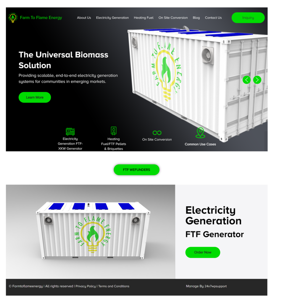
The current homepage does not introduce users to the company and its products
The original homepage opens with a carousel showing Farm to Flame’s products. The carousel was poorly constructed, with confusing language, oversized images and accessibility issues throughout.
FINDING #2:
Users are missing the call-to-action to invest
Across the site, there was only one call-to-action shown and the language used and location of the CTA lacked clarity and urgency.
01
How might we better introduce users to Farm to Flame and the products it offers?
02
How might we design a compelling call-to-action that converts more users to investors?
03
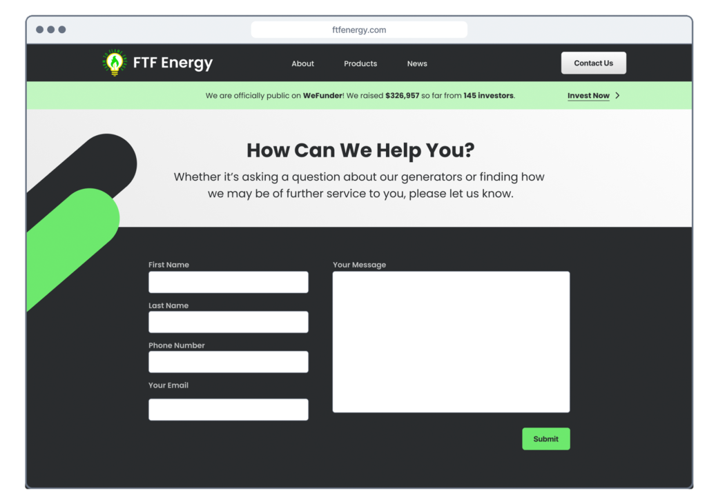
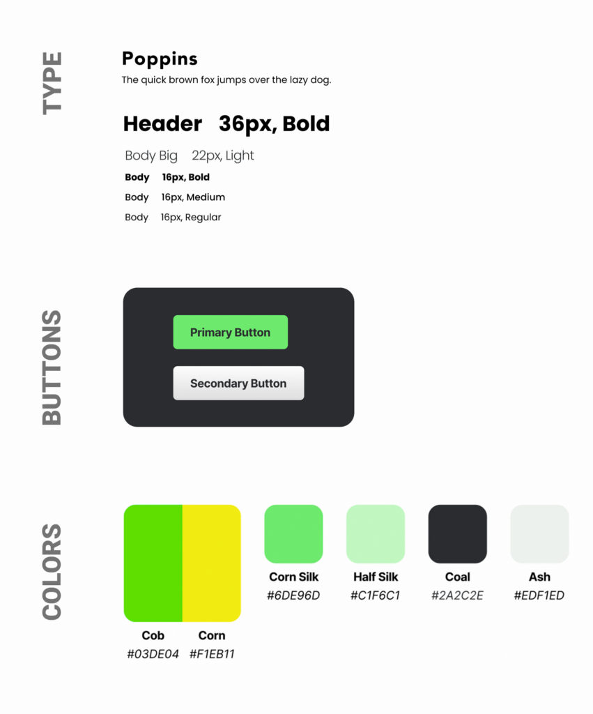
How might we improve UI and accessibility across the site?
ITERATION #1
Improved UI across the homepage
We began our redesign by drastically improving how products were presented on the homepage.
However, when tested, we were surprised to find the new homepage still ranked quite low in terms of user understanding of Farm to Flame and its products.
ITERATION #2
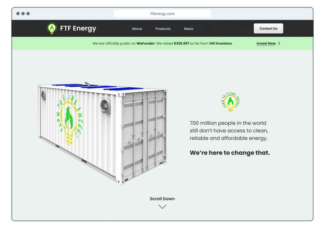
Creating a compelling company statement
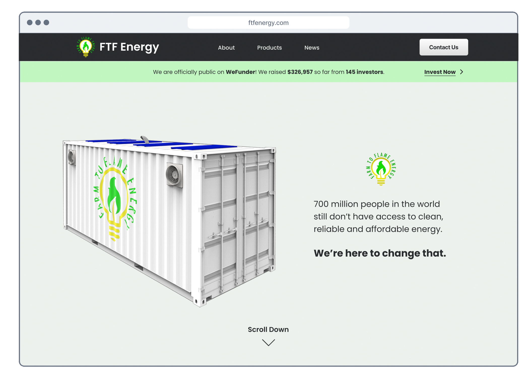
To further simplify the design, the second iteration opened with a hero image and an inspiring mission statement.
Increasing Conversions by 60%
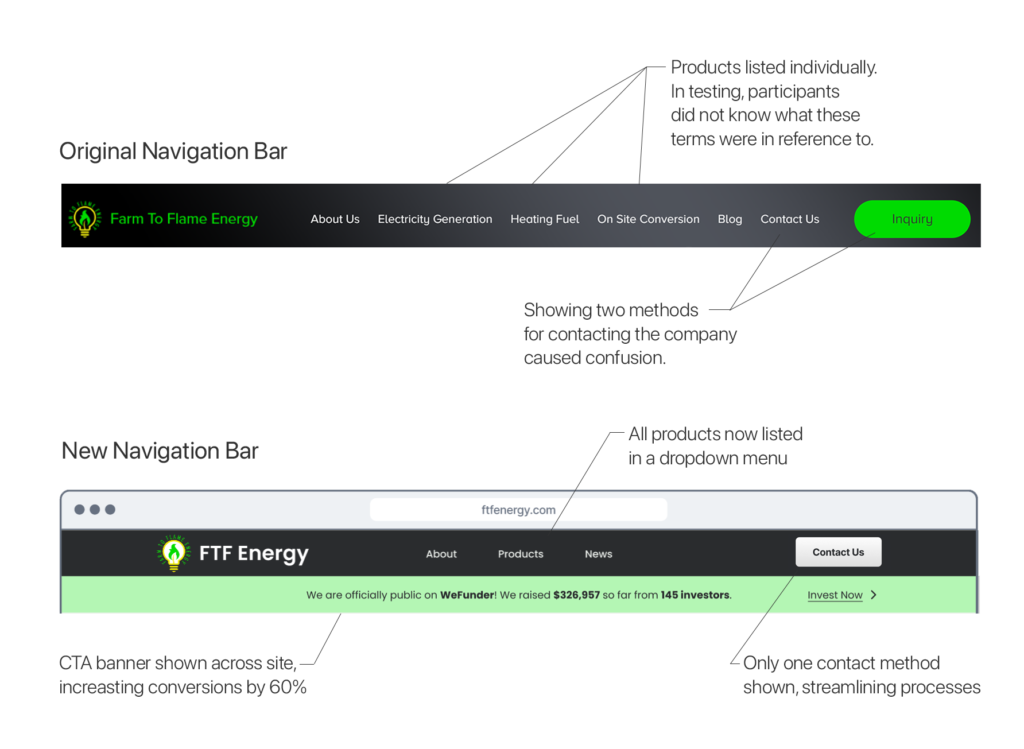
To convert more users into investors, we designed a banner alerting users to Farm to Flame’s fundraising efforts.
When tested, all 5 participants located this new call-to-action, a 60% increase from the original site.
We also simplified and reorganized the header to further streamline navigation.
Testing the existing product pages
FINDING #1
A lack of consistency
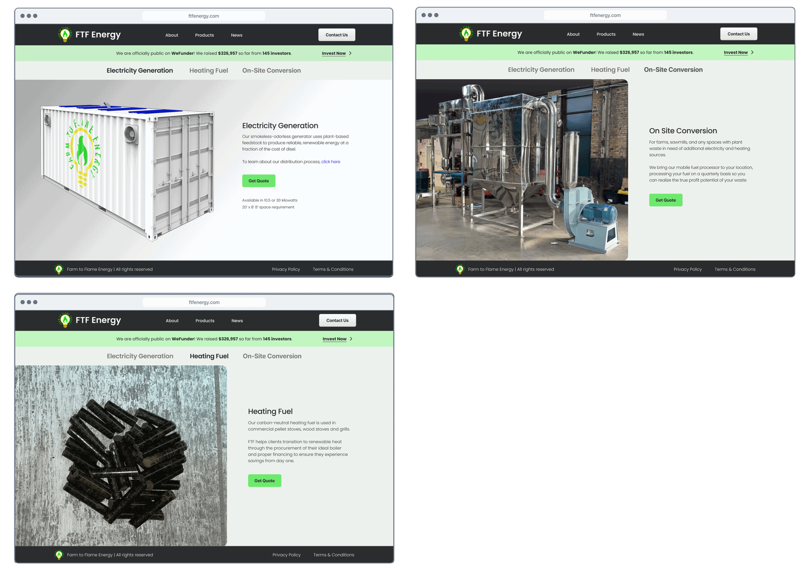
Photos and product specs were formatted differently on each product page. This inconsistency confused test participants, taking up valuable cognitive load.
FINDING #2:
A lack of flow from one product to another
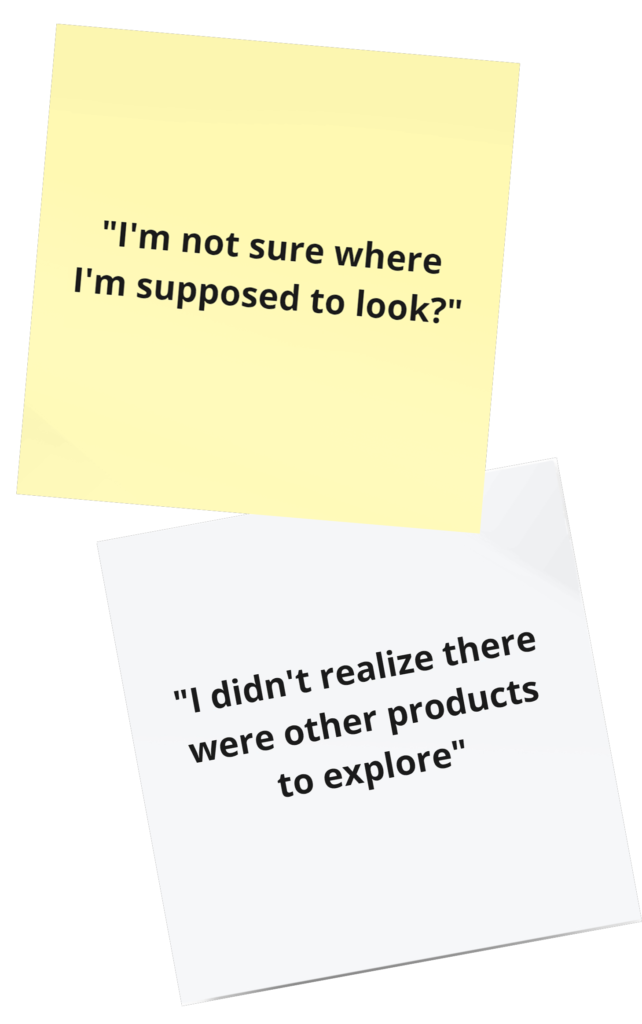
Once the user had reached the end of one product page, there was no indication there were additional product pages to explore.
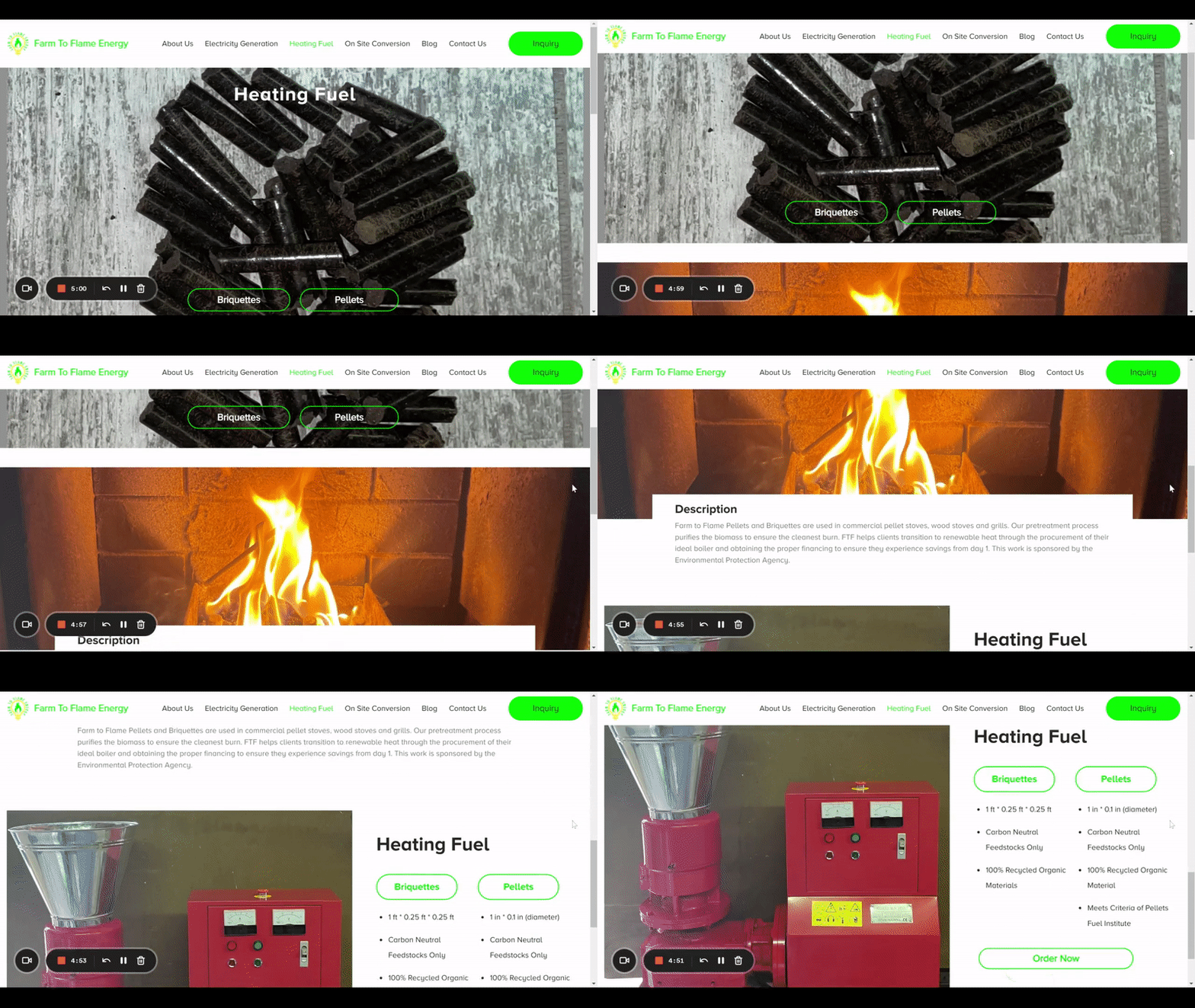
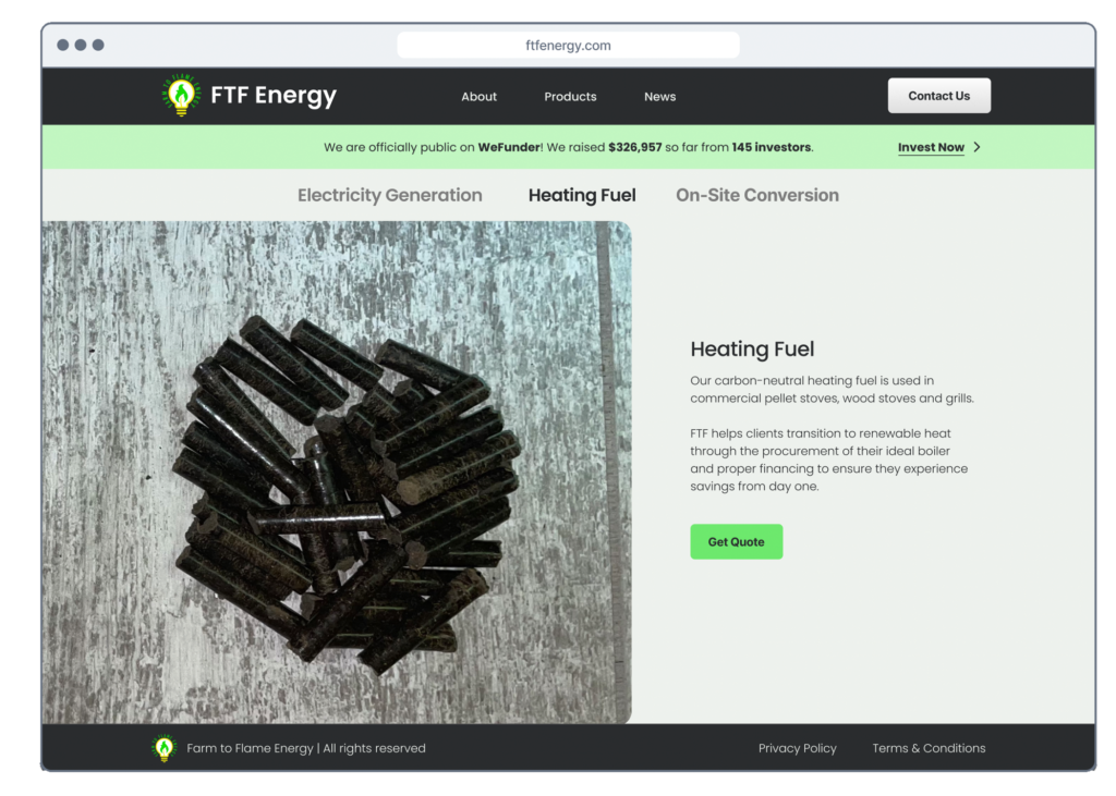
Streamlined Navigation & Consistent UI
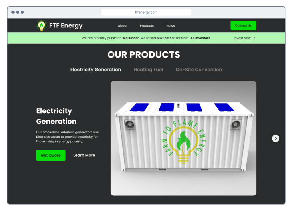
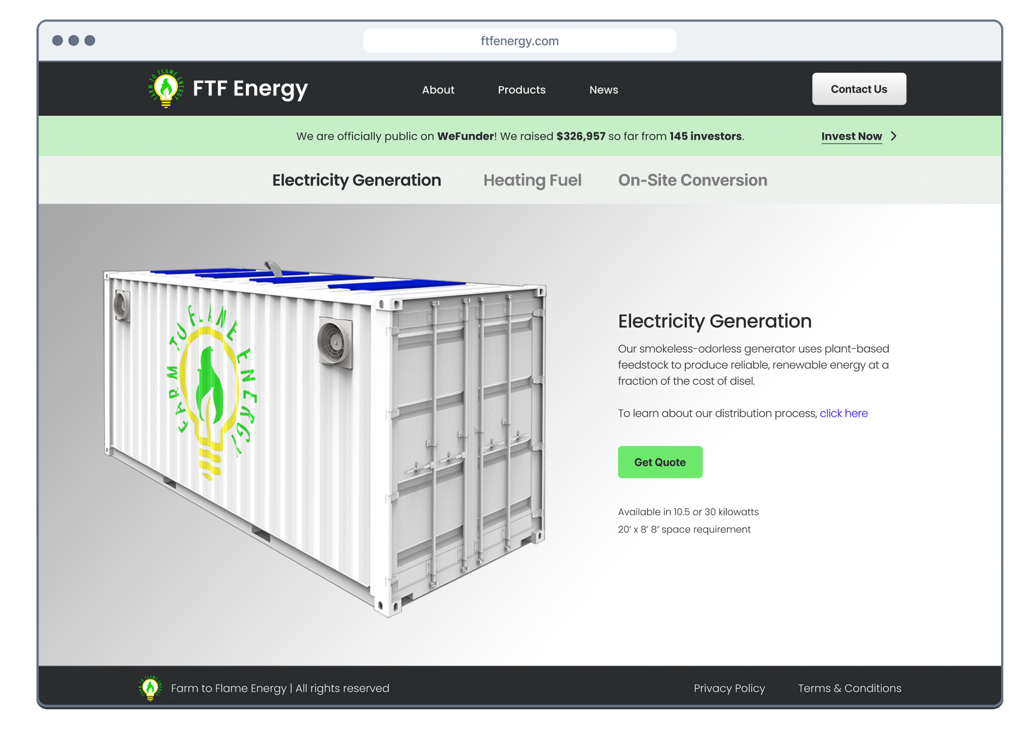
We designed one template that was applied to all three product pages. To streamline navigation, we added a segmented tab menu, allowing users to toggle easily between products.
IMPACT
A signifigant increase in user understanding
By creating consistency and easy flow between product pages, users were able to retain information far more easily.
As a result, users’ understanding of Farm to Flame’s products jumped from 2.2 out of 5 to 4 out of 5


Conclusion
Through strategic UI and smart marketing strategy, we increased users’ understanding of Farm to Flame and the products it offers by over 34%.
We also removed friction points throughout the site and designed a compelling call-to-action to invest, giving our client the platform they need to drastically increase their fundraising efforts.
KEY TAKEAWAYS
Advocate for the user
The stakeholder initially did not want to devote time and resources to user research. It was our job to communicate the value user insights would bring to the project.
Lean on research
The stakeholder had many ideas for the site. By testing these ideas with real users, we were able to show which ideas produced results aligned with their business goals and which did not.
IF I HAD MORE TIME
Assess analytics
I am currently working with Farm to Flame’s developers to implement this design. Once the new site is live, I will use analytics to measure how it performs in terms of sales, bounce rate and conversions.
